Friday, April 25, 2008

Activity of Finding Examples of Balance and Focal Point in Magazines... Forgot the Date!!! =[

I have never, in my whole life, looked at magazines by judgine whethe the pictures contained the principles of art, but I did that today in art. In the lesson, we ripped out pages from various magazines that contained the two principles of art; balance, and focal point/ emphasis. This helped me to understand what balance and focal point were much easily. I was amazed at how the photographs were taken; they all had balance by having different shapes, colours and lines mixed together. However, they all looked very natural and seemed as if they were just taken radomly! In my opinion, I think photography is a type of art as well, even though some say it's not.


Most, no, actually all of the pictures I ripped out were all asymmetrically balanced with a definite focal point, since there weren't any symmetrical advertisments in any of the magazines. I examined and sometimes asked others whether the pictures were appropriate. In the end, I chose five pictures that showed the two principles the most out of the whole magazine.

I also had to write about each one, saying why I chose it and where and how it actually showes balance and focal point.

Here are some photos scanned from my art diary:

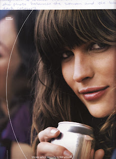
I asked Mrs Vincent why this one was balanced, and I learnt that the white arc at the left of the picture balanced the woman's dark hair. Also, the silver, tin can balanced the dark hair and the face.


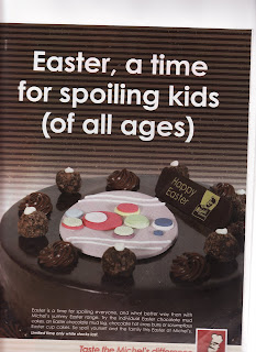
This picture definitely has a focal point by contrasting the warm colours and the cool colours. The pastel- toned pink at the centre of the cake and the white text contrasting to the dark background are the focal points. However, the picture is balanced as well, since there is the white text balancing with the dark chocolate mud cake with the pastel- toned decoration.


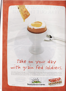
This photo has a very clear focal point; the boiled egg in the egg holder is the focal point. (Obviously!) This picture leasds the audience's eyes to the egg by placing it at the centre with white background in contrast to the egg's yolk. Also the size of egg helps being the focal point.

Thursday, April 24, 2008

Balance Activity... Don't Know the Date!!! =}

Balance is one of the principles of art. There are two types of balance; asymmetrical balance and symmetrical balance. Asymmetrical balance is when there is a work that is not exactly the same on both sides of the picture but is still creating the feeling of balance, and symmetrical balance is just as what it is; a work that is literally symmetrical on both sides. (When I say both sides, I mean sides like left and right or top and bottom. This depends on the middle axis that divides the work into two parts.)
We learnt and experimented more on this principle of art by having different coloured paper and sticking them on as different shapes, creating an example of a symmetrically balanced picture and an asymmetrically balanced picture. I realised that the type of colour used, such as whether it is cool or warm, and the size and arrangements of different shapes affected the feeling of having balance. Mrs Vincent also told us that warm colours stood out more than cool colours, so they were smaller in size to be balanced. Truly, when Mrs Vincent showed all of us a small piece of red paper with a large piece of blue, they looked balanced!
So, yes, I learnt a lot today and will probably do some more work on this principle next lesson as well.

Here is my example of SYMMETRICALLY BALANCED WORK:

Here is my example of ASYMMETRICALLY BALANCED WORK:
(Sorry for the quality of the images! The scanner couldn't really fit my art diary.)