Monday, May 19, 2008

My Colour Scheme of the Mask...

Okay, here are the rough colour schemes of the mask...

This is the Side View;
This is the Front View;


Friday, May 16, 2008

Animal Optical Illusions...

To have something else other than reflections for a chage, I have added some animal optical illusions so the reader doesn't get too bored with my blog...
Anyone interested in zebras and.., lions???

I like.., all these animals in the picture!!! How many can you find?

Can you see the illusion of the tree branches? I think it's pretty cool!
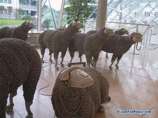

That's funny.. It's sort of freaky though...

The HeartPuppy! It's not really an illusion but I added it anyway. =]

These animal optical illusions can be found at the link below:

http://visualfunhouse.com/category/animal-optical-illusions

What We Have Been Doing in the Past Few Lessons...

For the past few lessons, we have started to create our masks. I never knew it had so many different steps and stages to go through!
First, each person had to stuff a plastic bag full of newspaper. This was going to be the basic shape of the head of the mask. Okay, since my head just wouldn't fit in to the plastic bag after I had stuffed in one whole booklet of newspaper, I had to use a lot more. I felt sort of sad... My head felt really big!!!

Then we stuck masking shapes around the plastic bag to make the shape of the head; mine had to be a penguin's head so it had to be round, but it turned out looking like a pumpkin. When we were done, it looked like a garbage dump full of newspaper. Secondly, we started to have the basic shape of the mask. As the lessons progressed, these basic shapes made of newspaper, a lot of masking tape and plastic bag, as well as cardboard, took more shapes and became detailed. I realised though, that my talent was not in making shapes out of newspaper. I was extra slow; I took two lessons doing ears and the fin of a dolphin and one lesson doing the beak. I still have to do the tail and the face!
I did my ears as cardboard, and I am planning to make the tail out of cardboard as well, except it would be stuffed with newspaper inside.
The next step, the third step, which I haven't gone into yet, was the start of paper- macheing. This was done with liquid glue (very gooey!) and strips of newspaper; the mask had to be covered with pieces of newspaper and really start to take shapes.
I can't wait till I start painting the mask though; I think I will be much better at that then making pumpkin- heads and stick- like beaks out of newspaper! =-)

Friday, May 2, 2008

Plan of My Mask...

WARNING: PLEASE DO NOT LAUGH OR BE TOO CRITICAL EVEN IF YOU THINK IT IS THE WORST DRAWING YOU HAVE EVER SEEN. IT'S NOT FUNNY TO LEAVE MEAN COMMENTS EITHER. I DID TRY YOU KNOW, AND EVERYONE KNOWS I AM NOT GOOD IN DRAWING!!! SO PLEASE BE KIND...

This is my plan of the mask I am going to make this term. The parts of the mask are all drawn from the animal pictures I researched in Term 1. This is sort of like the rough plan; just to see what the mask would look like. The actual design of the mask will be posted later on. Each box is a part of the mask, but I didn't do the shape of the head. (In case you wondered, it's the rounded head of a penguin. =])

Here it is! (READ THE WARNING AT THE TOP.)


Friday, April 25, 2008

Activity of Finding Examples of Balance and Focal Point in Magazines... Forgot the Date!!! =[

I have never, in my whole life, looked at magazines by judgine whethe the pictures contained the principles of art, but I did that today in art. In the lesson, we ripped out pages from various magazines that contained the two principles of art; balance, and focal point/ emphasis. This helped me to understand what balance and focal point were much easily. I was amazed at how the photographs were taken; they all had balance by having different shapes, colours and lines mixed together. However, they all looked very natural and seemed as if they were just taken radomly! In my opinion, I think photography is a type of art as well, even though some say it's not.


Most, no, actually all of the pictures I ripped out were all asymmetrically balanced with a definite focal point, since there weren't any symmetrical advertisments in any of the magazines. I examined and sometimes asked others whether the pictures were appropriate. In the end, I chose five pictures that showed the two principles the most out of the whole magazine.

I also had to write about each one, saying why I chose it and where and how it actually showes balance and focal point.

Here are some photos scanned from my art diary:

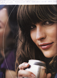
I asked Mrs Vincent why this one was balanced, and I learnt that the white arc at the left of the picture balanced the woman's dark hair. Also, the silver, tin can balanced the dark hair and the face.
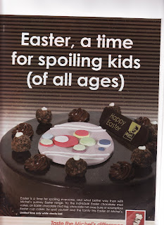


This picture definitely has a focal point by contrasting the warm colours and the cool colours. The pastel- toned pink at the centre of the cake and the white text contrasting to the dark background are the focal points. However, the picture is balanced as well, since there is the white text balancing with the dark chocolate mud cake with the pastel- toned decoration.
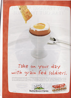

This photo has a very clear focal point; the boiled egg in the egg holder is the focal point. (Obviously!) This picture leasds the audience's eyes to the egg by placing it at the centre with white background in contrast to the egg's yolk. Also the size of egg helps being the focal point.

Thursday, April 24, 2008

Balance Activity... Don't Know the Date!!! =}

Balance is one of the principles of art. There are two types of balance; asymmetrical balance and symmetrical balance. Asymmetrical balance is when there is a work that is not exactly the same on both sides of the picture but is still creating the feeling of balance, and symmetrical balance is just as what it is; a work that is literally symmetrical on both sides. (When I say both sides, I mean sides like left and right or top and bottom. This depends on the middle axis that divides the work into two parts.)
We learnt and experimented more on this principle of art by having different coloured paper and sticking them on as different shapes, creating an example of a symmetrically balanced picture and an asymmetrically balanced picture. I realised that the type of colour used, such as whether it is cool or warm, and the size and arrangements of different shapes affected the feeling of having balance. Mrs Vincent also told us that warm colours stood out more than cool colours, so they were smaller in size to be balanced. Truly, when Mrs Vincent showed all of us a small piece of red paper with a large piece of blue, they looked balanced!
So, yes, I learnt a lot today and will probably do some more work on this principle next lesson as well.

Here is my example of SYMMETRICALLY BALANCED WORK:

Here is my example of ASYMMETRICALLY BALANCED WORK:
(Sorry for the quality of the images! The scanner couldn't really fit my art diary.)

Monday, March 24, 2008

My Collection of Sketches of Observational Drawings...

This is a collection of sketches that I did in class; they are observational drawings of a panda.

My first drawing was a two- minute continual drawing. I had started much better, but I realised I had drawn it too small, so I wasted one and a half minutes rubbing out my drawing! It was quite frustrating when I only had barely thirty seconds and I couldn't take off my pencil because it was 'contiunual drawing'!!!


The next activity was two- minute blind contour drawing. I had to draw this without looking once at my paper and only look on the object I was drawing. I also vainly tried to show the fur, but it turned out not working at all. The face looks very interesting!!! :D

After that, I was at the hardest stage of the whole activity. This activity was blind contour drawing.It was the hardest that we did, in my opinion. It is impossible to be beautiful when you are drawing with continuous lines without looking at what you are drawing. As expected, my drawing turned out hideous. No texture tone, nothing but squiggly lines! Thanks to this, we all had a good laugh at each other's drawings that looked like three- year olds.


Next drawing was a drawing of ten- minute observation. It looked much better than teh former drawings, but there should have been fur and some tone/shadows. It looks incomplete and bare... =.}


This drawing shown below was the sideview of the panda; just as the former one, it needed to tone and at least some indications of fur as well. I drew this because I was told to draw it at a different angle of view or get a new stuffed toy to draw, and I thought sideview of the same toy would be good to draw. So here it is!