Today, my mask was finally due! From lunch, I desperately tried to finish painting my mask, and I succeeded! J I was slightly disappointed that the quality of colour blending and painting- especially around the eyes- wasn’t as good as I wished towards the end of the lesson, but I was glad I at least finished sticking to my colour scheme.
I completed blending various parts of my mask to the other parts, such as from the dorsal fin to the face and from face to the tail.
Although I had wanted to paint the eyes black to white, there wasn’t any black paint, so I had to mix dark brown with grey to create dark grey to blend to white-grey instead. My beak turned out much darker than what I wanted, but I also didn’t have time to fix this either so they had to be left dark, dark brown.
At the nick of time, I also sprayed gloss on my tail and beak as well as throughout my whole mask. I sprayed especially a lot on my tail, to give the slick, shiny texture of a dolphin’s.
I don’t consider my mask ‘perfect’ or ‘awesome’, but I think it doesn’t look too bad. One thing has definitely improved for me though; I really, really improved on colour blending from all this painting!!!
Thursday, October 30, 2008

Wednesday, October 29, 2008
29th Oct... The Day Before the Mask is DUE!!!
Tomorrow is the date that the mask is due! I have even brought the mask home to paint. So far, the face of the mask has been, as planned, painted from brown at the tip of the tail to yellow at the end of the head back to red again to blend the colours of the beak in. The ears have been painted from red somehow blending into chocolate brown to mahogany, dark brown, and eyes have been blended from indigo blue to icy sky blue.
Now I still have another ear to complete as well as the beak and the edges of the eyes. Cassidy suggested that the edges of the eyes could blend from black to white, giving contrast to the other colours of the mask but also harmoniously arranged with different tones of blue to give the focal point.
I sincerely hope that I can finish painting the mask tomorrow!!!
Now I still have another ear to complete as well as the beak and the edges of the eyes. Cassidy suggested that the edges of the eyes could blend from black to white, giving contrast to the other colours of the mask but also harmoniously arranged with different tones of blue to give the focal point.
I sincerely hope that I can finish painting the mask tomorrow!!!
Sunday, October 26, 2008
What's Happening With Painting Mask??? 22.10.08
Today I kept on painting my mask. At the start of the lesson, Mrs Vincent made a shocking (well, to me anyway) comment; she told us that we shouldn't all paint our masks in rainbow colours. I had planned that I would blend from brownish-red to purple throughout the mask, which was exactly the rainbow colours! However Mrs Vincent suggested to me that maybe I should blend from red to yellow then blend back to red again at the beaks, and paint the eyes in cool colours to give them contrast to the mask.
So, at lunch, I worked on it a bit more and it seems to be getting some quite good colour blending. I'm becoming faster at it too!
I really, really can't wait till my mask is finished!!! =]
So, at lunch, I worked on it a bit more and it seems to be getting some quite good colour blending. I'm becoming faster at it too!
I really, really can't wait till my mask is finished!!! =]
Monday, October 20, 2008
In The Hols... What Happened To My Mask?
I painted my mask's tail in the holidays. I decided taht Iwould paint it from yellow slowly blending to red, then finishing as dark brown at the tips. This emant that the colours went yellow-light yellow-light orange-orange-crimson-dark, dark read (mauve?)-dark brown.
I also painted the dorsal fin, blending from red back to yellow, finishing as light green.
Then, in class, I continued completing the texture for golden retriever and painted gesson on the face of the mask. I am planning to paint it from light purple to pink to orange, blending to the yellow at the tail. The beak will probably start as darker violet or indigo, though. The ears will be from purple to sky-blue. This is different to what I had originally planned, but I think this new colour scheme will look better for my mask and show my personality better in ways.
I can't wait till I start painting! (Well, the face anyway.) But I still have to finish the last few parts of texture and finish putting on gesso... I'm worried I might not be able to finish the mask in time!!! ={
I also painted the dorsal fin, blending from red back to yellow, finishing as light green.
Then, in class, I continued completing the texture for golden retriever and painted gesson on the face of the mask. I am planning to paint it from light purple to pink to orange, blending to the yellow at the tail. The beak will probably start as darker violet or indigo, though. The ears will be from purple to sky-blue. This is different to what I had originally planned, but I think this new colour scheme will look better for my mask and show my personality better in ways.
I can't wait till I start painting! (Well, the face anyway.) But I still have to finish the last few parts of texture and finish putting on gesso... I'm worried I might not be able to finish the mask in time!!! ={
Erm... Yeah. What's Happening To My... MASK? 10.9.08
I have started my texture of golden retriever! With modelling paste and paddlepop stick, I scraped and 'scratched' modelling paste to the mask, spreading outwards from the nose, or rather, its beak. Mrs Vincent had told us in previous lessons that the texture was to be exaggerated. However mine had still looked textureless after my first go, since I was afraid I would ruin my mask if my texture was too thick. I tried to show the thin(?) texture of the golden retriever's fur, but the texture ended up looking much more different. I'm not sure, but my friends tell me that it looks like a golden retriever's fur, so hopefully the texture will work out. =]
The ears seem the most challenging, though, since the fur is very long, but soft, (golden retriever agai!) and I'm not sure how I'm supposed to show that. Hopefully, I'll finish all the texture except the ears this week! =]
The ears seem the most challenging, though, since the fur is very long, but soft, (golden retriever agai!) and I'm not sure how I'm supposed to show that. Hopefully, I'll finish all the texture except the ears this week! =]
Again... Wha'ts With My Mask Now??? 2.9.08
Today I started painting texture onnto my mask. I knew that I was going to create actual texture, not simulated, so I worked out what the texture would be like for each part of the mask. for the beak and the tail, since they were penguins and dolphi's, they were decided to be smooth and glossy, using gesso. The main head was going to be short, slightly wavy fur, spreading out from the nose, while the ears were going to be long, soft, wavy fur. I started on the tail with a thick paintbrush, paingint the gesso on one way, outwards.
Next lesson, I am planning to do the beak. I'm not sure whether I should add another layer to my ears- I think they are a bit too thin, but I'll see; since I don't want to have them too heavy with my thick coat of gesso for texture.
Next lesson, I am planning to do the beak. I'm not sure whether I should add another layer to my ears- I think they are a bit too thin, but I'll see; since I don't want to have them too heavy with my thick coat of gesso for texture.
What's Happening With My Mask?!? 27.8.08
This was a very productive lesson. I finally finished sticking on my ears! Mrs Vincent helped me put on the ear with masking tape. It was orginally inteneded that the ear would be raised and flop outwards, but then the decision was altered so the ears stayed down. Mrs Vincent also cut out the eyeholes for me. I was very surprised when this brought the mask so much more animal characteristics. They were shaped as round-triangles, so when I paint the edges thick with black paint, they will actually look like a golden retreiever's eyes!
I also went back at lunch, and I almost finished my final layer. From next lesson, hopefully and with luck, I will start my texture. I think I will do physical texture rather than simulated, since I'm not really confident with drawing on the texture with pain using tone and colour.
I also went back at lunch, and I almost finished my final layer. From next lesson, hopefully and with luck, I will start my texture. I think I will do physical texture rather than simulated, since I'm not really confident with drawing on the texture with pain using tone and colour.
What's Happening So Far??? 21.8.08
I found that my bottom of the mask, which I had added about five more layers last time, had hardened enough to be cut out. Therefore Mrs Vincent cut out a round hole with a knife, and I took out all the bundled-up newpaper balls. then I continued paper-macheing the mask, and soon I'll finish the final layer and start on texture! I was planning to show my texture physically, but Mrs Vincent suggested I could also show simulated texture by painting the texture onto the mask. I'm considering what to do... =]
Tuesday, August 26, 2008
COLOURWHEEL
We're learning about colour wheels... Here are some I found on the Internet. There's also analogous colours and..., contrasting (?) colours.


Term 3 Update - What's Happening With My Mask??? (19/8/08)
Today, I resumed what I had been doing with my mask. Mrs Vincent explained to us how to show texture, creating it with white 'paste' and paddlepop stick. Even though I'm not done paper- macheing, I'm looking forward to doing it soon.
I'd hoped I would be able to cut out a hole in the mask today, but I realised the bottom was still way too soft. So I glued on a few more layers. About FIVE, to be accurate!!!
I also started on my long- delayed ears. I traced my ear shape template to the cardboards. Mrs Vincent then helped me mask- taped them (actually, Mrs Vincent did all the work while I just gawked.) to the correct positions on my mask. With the ears, I mean one ear, now it looked much more like an actual animal mask!
Mrs Vincent told us that the last layer of paper- mache was to be white butcher paper, not newspaper. I still haven't finished this layer. Maybe I'll go to the art room tomorrow and work on my mask, especially my EARS!!!
I'd hoped I would be able to cut out a hole in the mask today, but I realised the bottom was still way too soft. So I glued on a few more layers. About FIVE, to be accurate!!!
I also started on my long- delayed ears. I traced my ear shape template to the cardboards. Mrs Vincent then helped me mask- taped them (actually, Mrs Vincent did all the work while I just gawked.) to the correct positions on my mask. With the ears, I mean one ear, now it looked much more like an actual animal mask!
Mrs Vincent told us that the last layer of paper- mache was to be white butcher paper, not newspaper. I still haven't finished this layer. Maybe I'll go to the art room tomorrow and work on my mask, especially my EARS!!!
What's Happening So Far in My Texture Task?!
For this Texture Task, many photos illustrating textures of different animals were found. There was a minimum of 6 animals, of which included the 3 chosen animals. This was to help with creating simulated texture or real texture on the mask later, showing our personality through colour, shape and lines. I found pictures of animals such as crocodile and chameleon, who had extraordinary skin.
Next, I had to explain verbally about the textures, explaining aspects such as the colours and shapes, and how they formed the animal skin. When the textures were all observed, it was time to plan the texture on maks. I drew the profile view, the back view and the front view of the mask. Mrs Vincent would give us more activities to help us with this process.
I am also finding some photos of how the animal's eyes and face is surrounded by the texture.
Next, I had to explain verbally about the textures, explaining aspects such as the colours and shapes, and how they formed the animal skin. When the textures were all observed, it was time to plan the texture on maks. I drew the profile view, the back view and the front view of the mask. Mrs Vincent would give us more activities to help us with this process.
I am also finding some photos of how the animal's eyes and face is surrounded by the texture.
Thursday, June 19, 2008
My Art Created Creature Advertisement
I took quite many steps to solve this problem of making a created creature advertisement.
First of all, I planned out which physical features would be from each animal. I decided that since I didn’t know how to use Photoshop, I just made a draft layout of my animal, combining different features from the three animals I chose.
Then, I started to work on the lettering; the text. I found this harder than drawing the layout of the advertisement animal. In the end, after brainstorming visual words for each animal, I decided that my penguin would be dark, my dolphin would be sleek and my dog cuddly.
After this step of creating the advertisement, I played around with the words to see how the text would be lettered to visually show the appearance of the three animals while including all the principles and elements of art. I attempted, and even though I’m not utterly, totally satisfied with it, I think the words pretty much fill in all the requirements. I might need to work on being a bit more creative though.
My draft layout was all colour blending; I didn’t know what else to do, since I wasn’t really sure what the meaning of my advertisement was at that step. So I just colour- blended from pink at the top of the head to brown at the toes. I also added silver swirls for more interest and focal point. It did look more creative but it wasn’t much of a focal point. I planned where my words would be placed in terms of balancing the advertisement.
After all of the drafts, planning and asking Mrs Vincent whether I was actually on the right track, I started on my final version in the Art lesson. Mrs Vincent told me that I could just do what I did for my draft, except there would need to be a distinctive focal point.
When I had sketched my animal and the words, I started colouring them in. But this time, I knew the meaning of my advertisement; warmth of the animal. So, instead of going from pink to brown, I blended the colours in this order; pink- purple- blue- lime- green- yellow- orange- red- back to pink. Mrs Vincent suggested that the colour at the bottom should match the colour at the top so it looked like a cycle of colours. I did the animal’s arms with blue to green to brown. For the swirls, instead of silver, I decided to have gold instead, to show more warmth.
The letterings were quite challenging. Even though I had already planned them out, I still changed them slightly.
I decided to have the background darker colour than the animal and the letterings, since I wanted a big contrast in order for them to stand out and show the warmth with warm colours.
In general, I had quite some fun making this advertisement. I didn’t really understand what to do at first, but when I understood and really started my work, I found it fascinating. Also, since I love colour- blending (It is my favourite part of art! =)) I liked colouring the advertisement in as well. In terms of creativeness, it wasn’t the most creative piece of work, but I don’t think it wasn’t that bad- looking, like some of my friends call it pumpkin head!!!
Thursday, June 5, 2008
Just Wondering... Do YOU Consider Photography as ART?!?!?
I just had this pondering..., do you consider photography as art? There was an issue about this, as some people say that it isn't. But I think it is; certainly! Just look at the photos below and think whether you do or not;

Silver Drops. Raspberries.
So, what do YOU think? Do you think photography as art, or not?
Finally!!! PAPER MACHE!!! =D
Yep, yep, yep, yes, yes!!! Hanna Kang, the slowest in the class, is FINALLY up to the paper macheing! Goodness, after about seven lessons of 'hard' work of scrunching newspapers and taping, I was so excited to have that gooey glue on my hands as well.
First, I ripped strips of newspaper. Since I had observed how other people did theirs, I easily knew what to do and decided to rip with my ruler. I ended up ripping them too thin and long, but they were torn in ripped in neat rectangles, so I was satisfied. ;)
Next, Emma poured the white, very- gooey glue from the bucket to the container. It looked, to be honest, disgusting, so I was reluctant to put my hands in it, but once I did, I liked it so much! :) I stuck the strips of newspaper that were soaked in glue, and spread glue on top of the strips of newspaper to make sure they stayed on the mask. I worked my way from the top to the sides to the tail, beak and the bottom. I didn't get to finish the first layer, but I did about half of the mask, which I was really happy with. The strips of newspaper were layed out on the mask so they looked organised instead of just 'stuck on randomly'. For the rest of the lesson, I continued on glueing the strips of newspaper to the mask that actually looked like a mask now.
I am very looking forward to the next art lesson. Hopefully I will be able to finish my first layer and start my second! =]
First, I ripped strips of newspaper. Since I had observed how other people did theirs, I easily knew what to do and decided to rip with my ruler. I ended up ripping them too thin and long, but they were torn in ripped in neat rectangles, so I was satisfied. ;)
Next, Emma poured the white, very- gooey glue from the bucket to the container. It looked, to be honest, disgusting, so I was reluctant to put my hands in it, but once I did, I liked it so much! :) I stuck the strips of newspaper that were soaked in glue, and spread glue on top of the strips of newspaper to make sure they stayed on the mask. I worked my way from the top to the sides to the tail, beak and the bottom. I didn't get to finish the first layer, but I did about half of the mask, which I was really happy with. The strips of newspaper were layed out on the mask so they looked organised instead of just 'stuck on randomly'. For the rest of the lesson, I continued on glueing the strips of newspaper to the mask that actually looked like a mask now.
I am very looking forward to the next art lesson. Hopefully I will be able to finish my first layer and start my second! =]
Monday, May 19, 2008
My Colour Scheme of the Mask...
Okay, here are the rough colour schemes of the mask...
This is the Side View;
This is the Front View;

This is the Front View;

Friday, May 16, 2008
Animal Optical Illusions...
To have something else other than reflections for a chage, I have added some animal optical illusions so the reader doesn't get too bored with my blog...
 Anyone interested in zebras and.., lions???
 I like.., all these animals in the picture!!! How many can you find?

Anyone interested in zebras and.., lions??? I like.., all these animals in the picture!!! How many can you find? Can you see the illusion of the tree branches? I think it's pretty cool!
That's funny.. It's sort of freaky though...
The HeartPuppy! It's not really an illusion but I added it anyway. =]
These animal optical illusions can be found at the link below:
What We Have Been Doing in the Past Few Lessons...
For the past few lessons, we have started to create our masks. I never knew it had so many different steps and stages to go through!
First, each person had to stuff a plastic bag full of newspaper. This was going to be the basic shape of the head of the mask. Okay, since my head just wouldn't fit in to the plastic bag after I had stuffed in one whole booklet of newspaper, I had to use a lot more. I felt sort of sad... My head felt really big!!!
Then we stuck masking shapes around the plastic bag to make the shape of the head; mine had to be a penguin's head so it had to be round, but it turned out looking like a pumpkin. When we were done, it looked like a garbage dump full of newspaper. Secondly, we started to have the basic shape of the mask. As the lessons progressed, these basic shapes made of newspaper, a lot of masking tape and plastic bag, as well as cardboard, took more shapes and became detailed. I realised though, that my talent was not in making shapes out of newspaper. I was extra slow; I took two lessons doing ears and the fin of a dolphin and one lesson doing the beak. I still have to do the tail and the face!
I did my ears as cardboard, and I am planning to make the tail out of cardboard as well, except it would be stuffed with newspaper inside.
The next step, the third step, which I haven't gone into yet, was the start of paper- macheing. This was done with liquid glue (very gooey!) and strips of newspaper; the mask had to be covered with pieces of newspaper and really start to take shapes.
I can't wait till I start painting the mask though; I think I will be much better at that then making pumpkin- heads and stick- like beaks out of newspaper! =-)
First, each person had to stuff a plastic bag full of newspaper. This was going to be the basic shape of the head of the mask. Okay, since my head just wouldn't fit in to the plastic bag after I had stuffed in one whole booklet of newspaper, I had to use a lot more. I felt sort of sad... My head felt really big!!!
Then we stuck masking shapes around the plastic bag to make the shape of the head; mine had to be a penguin's head so it had to be round, but it turned out looking like a pumpkin. When we were done, it looked like a garbage dump full of newspaper. Secondly, we started to have the basic shape of the mask. As the lessons progressed, these basic shapes made of newspaper, a lot of masking tape and plastic bag, as well as cardboard, took more shapes and became detailed. I realised though, that my talent was not in making shapes out of newspaper. I was extra slow; I took two lessons doing ears and the fin of a dolphin and one lesson doing the beak. I still have to do the tail and the face!
I did my ears as cardboard, and I am planning to make the tail out of cardboard as well, except it would be stuffed with newspaper inside.
The next step, the third step, which I haven't gone into yet, was the start of paper- macheing. This was done with liquid glue (very gooey!) and strips of newspaper; the mask had to be covered with pieces of newspaper and really start to take shapes.
I can't wait till I start painting the mask though; I think I will be much better at that then making pumpkin- heads and stick- like beaks out of newspaper! =-)
Friday, May 2, 2008
Plan of My Mask...
WARNING: PLEASE DO NOT LAUGH OR BE TOO CRITICAL EVEN IF YOU THINK IT IS THE WORST DRAWING YOU HAVE EVER SEEN. IT'S NOT FUNNY TO LEAVE MEAN COMMENTS EITHER. I DID TRY YOU KNOW, AND EVERYONE KNOWS I AM NOT GOOD IN DRAWING!!! SO PLEASE BE KIND...

This is my plan of the mask I am going to make this term. The parts of the mask are all drawn from the animal pictures I researched in Term 1. This is sort of like the rough plan; just to see what the mask would look like. The actual design of the mask will be posted later on. Each box is a part of the mask, but I didn't do the shape of the head. (In case you wondered, it's the rounded head of a penguin. =])
Here it is! (READ THE WARNING AT THE TOP.)
Friday, April 25, 2008
Activity of Finding Examples of Balance and Focal Point in Magazines... Forgot the Date!!! =[
I have never, in my whole life, looked at magazines by judgine whethe the pictures contained the principles of art, but I did that today in art. In the lesson, we ripped out pages from various magazines that contained the two principles of art; balance, and focal point/ emphasis. This helped me to understand what balance and focal point were much easily. I was amazed at how the photographs were taken; they all had balance by having different shapes, colours and lines mixed together. However, they all looked very natural and seemed as if they were just taken radomly! In my opinion, I think photography is a type of art as well, even though some say it's not.
Most, no, actually all of the pictures I ripped out were all asymmetrically balanced with a definite focal point, since there weren't any symmetrical advertisments in any of the magazines. I examined and sometimes asked others whether the pictures were appropriate. In the end, I chose five pictures that showed the two principles the most out of the whole magazine.
I also had to write about each one, saying why I chose it and where and how it actually showes balance and focal point.
Here are some photos scanned from my art diary:
Most, no, actually all of the pictures I ripped out were all asymmetrically balanced with a definite focal point, since there weren't any symmetrical advertisments in any of the magazines. I examined and sometimes asked others whether the pictures were appropriate. In the end, I chose five pictures that showed the two principles the most out of the whole magazine.
I also had to write about each one, saying why I chose it and where and how it actually showes balance and focal point.
Here are some photos scanned from my art diary:
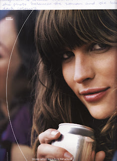 I asked Mrs Vincent why this one was balanced, and I learnt that the white arc at the left of the picture balanced the woman's dark hair. Also, the silver, tin can balanced the dark hair and the face.
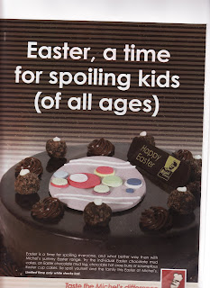
This picture definitely has a focal point by contrasting the warm colours and the cool colours. The pastel- toned pink at the centre of the cake and the white text contrasting to the dark background are the focal points. However, the picture is balanced as well, since there is the white text balancing with the dark chocolate mud cake with the pastel- toned decoration.
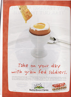
This photo has a very clear focal point; the boiled egg in the egg holder is the focal point. (Obviously!) This picture leasds the audience's eyes to the egg by placing it at the centre with white background in contrast to the egg's yolk. Also the size of egg helps being the focal point.
Thursday, April 24, 2008
Balance Activity... Don't Know the Date!!! =}
Balance is one of the principles of art. There are two types of balance; asymmetrical balance and symmetrical balance. Asymmetrical balance is when there is a work that is not exactly the same on both sides of the picture but is still creating the feeling of balance, and symmetrical balance is just as what it is; a work that is literally symmetrical on both sides. (When I say both sides, I mean sides like left and right or top and bottom. This depends on the middle axis that divides the work into two parts.)


We learnt and experimented more on this principle of art by having different coloured paper and sticking them on as different shapes, creating an example of a symmetrically balanced picture and an asymmetrically balanced picture. I realised that the type of colour used, such as whether it is cool or warm, and the size and arrangements of different shapes affected the feeling of having balance. Mrs Vincent also told us that warm colours stood out more than cool colours, so they were smaller in size to be balanced. Truly, when Mrs Vincent showed all of us a small piece of red paper with a large piece of blue, they looked balanced!
So, yes, I learnt a lot today and will probably do some more work on this principle next lesson as well.
Here is my example of SYMMETRICALLY BALANCED WORK:
Here is my example of ASYMMETRICALLY BALANCED WORK:
(Sorry for the quality of the images! The scanner couldn't really fit my art diary.)
Subscribe to:
Posts (Atom)

